On This Date In Music – Rolling Stones’ Sticky Fingers LP
 May 25 – On this date in 1971, the Rolling Stones’ latest LP, Sticky Fingers, was sitting atop the album chart in both the U.S. and England, becoming the band’s first chart-topper on both sides of the pond. Musically, the album is a landmark achievement for the band, as they were able to redirect public opinion away from the bad press of their last few years back onto what they did best: Sing about sex, drugs, and rock and roll. But all these years later, what people think about and talk about just as much as music on Sticky Fingers is that historic cover.
Sometime in 1969, Mick Jagger found himself at a party with Andy Warhol, pop artist extraordinaire. Warhol had recently designed the album cover for the Velvet Underground’s debut LP, Velvet Underground & Nico, with its simple painting of a banana. Warhol and Jagger got to talking at the party and the conversation turned to album covers. Warhol made a comment that stuck with Jagger. He said something about how cool it would be if an album cover featured an actual working zipper. Jagger was intrigued and, as work developed on the next Stones album, he wrote a letter to Warhol and asked him to handle the design.
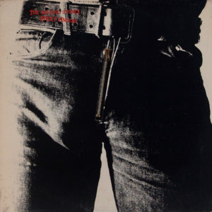
Warhol set up a photo shoot and took a number of pictures of blue-jeaned male models’ crotches. Because Warhol used a number of different models before selecting the final shot, he claimed to not even know whose crotch shot was ultimately used. Despite rumors, it was not Mick Jagger’s crotch as he wasn’t at the photo shoot (although Jagger was often slow to deny this, for obvious reasons).
![]() Craig Braun, who was hired to take Warhol’s design and make it a reality, did just that. His final design featured a working zipper that opened to reveal an image of cotton briefs. But that was only part of the unique artwork of Sticky Fingers. The album also featured a logo for the band. That idea was inspired by Mick Jagger’s prominent lips and his having recently seen a painting of the Hindu goddess Kali, who is almost always shown with her tongue sticking out. Jagger wanted something similar to represent the band. He commissioned designer John Pasche, who came up with a black and white version of the now famous tongue and lips logo. Pasche sent that design to Braun, who modified it slightly, painting it red, and included it on the inside of the album. This was the first use of the logo that would soon come to personify the Rolling Stones.
Craig Braun, who was hired to take Warhol’s design and make it a reality, did just that. His final design featured a working zipper that opened to reveal an image of cotton briefs. But that was only part of the unique artwork of Sticky Fingers. The album also featured a logo for the band. That idea was inspired by Mick Jagger’s prominent lips and his having recently seen a painting of the Hindu goddess Kali, who is almost always shown with her tongue sticking out. Jagger wanted something similar to represent the band. He commissioned designer John Pasche, who came up with a black and white version of the now famous tongue and lips logo. Pasche sent that design to Braun, who modified it slightly, painting it red, and included it on the inside of the album. This was the first use of the logo that would soon come to personify the Rolling Stones.
Decades later, as much as the album is remembered for its music, it is also the artwork that so many people talk about. Rock critic Richard Harrington has said: “This album heralded an age of really imaginative and provocative packaging. It also introduced the greatest band logo of all time.” Those two things are no small feat, along with some of the best Rolling Stones music of the seventies.
(Reprinted and edited with permission from Michael Walter author of “On This Date In Music”). For further insight on the production of the album cover’s unique design, the Rolling Stone’s music, and other dates in music history, get Michael’s book at OnThisDateInMusic.com. #OnThisDateInMusic #MichaelWalter